Hot vs Cold Lighting — Which Suits Your Home Best?
Mary Jane ThorntonLighting is more than just a bulb and a shade. The colour temperature (i.e. “warm” / “hot” tones vs “cool” / “cold” tones) can dramatically affect how a room feels, how colours appear, and how you experience a space. Let’s dive into the differences, and help you pick what’s right for your home.
What do “warm” and “cool” mean in lighting?
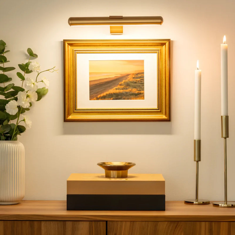
- Warm light (often called “warm white”) typically has a colour temperature around 2,700 K to 3,300 K. It gives off an amber, cozy, yellowish glow.
- Cool light (or “cool white” / “daylight”) often falls in the range 4,000 K to 6,500 K, leaning toward white or slightly bluish tones.
These temperature labels can feel counterintuitive. “Warm” light looks more yellow/orange, “cool” light more white/blue.
Effects on mood, space & décor
- Warm lighting tends to be more relaxing, flattering, and intimate. It works well in bedrooms, living rooms, dining areas — spaces where you want softness and warmth.
- Cool lighting brings crispness, alertness, and clarity. It’s ideal for kitchens, bathrooms, home offices, or areas where tasks and detail work happen.
- In a neutral space, you can mix both: warm ambient + cool task lighting. Just be careful not to create jarring contrasts in adjoining areas.
Matching to room purpose & décor
- Rooms with dark woods, reds, earthy tones often harmonize beautifully with warm lighting, enhancing their richness.
- Spaces with whites, grays, black, metal, glass can benefit from cooler lighting to keep things crisp and modern.
- For open-plan homes, aim for a “base” tone (say 3,000–3,500 K) then layer cooler or warmer accents where needed.
Tips & cautions
- Don’t go too extreme. Very cold light (6,500 K) can feel sterile or hospital-like in a living room.
- Check CRI (Color Rendering Index). a higher CRI (80+ or better) ensures your colours look natural under the bulb.
- Use dimmers or tunable bulbs. This gives flexibility: warm mood in the evening, cooler light when cleaning or working.
- Ensure consistency in open spaces. If adjacent areas use very different colour temperatures, the transition can feel disjointed.